
Part I – Paint
How to use inspiration pictures.
Have you ever used Houzz, or Pinterest to get inspiration when you wanted to redecorate? Of course you have. We all do it. Even interior designers and decorators do it. So why is it that if you copy the design in the photo, you are met with disappointment? Let me help you understand why.
Collecting inspirational pictures, or photos, is something that I ask my new clients to do prior to our first meeting. Frederick R. Barnard coined the phrase, “A picture is worth a thousand words” in 1921, and it still stands true today. Although I listen carefully, being able to see the ideas that the client likes, is a great help in the process of redecorating. We take elements of the inspiration photos when we are designing their space. What we don’t do is copy every last detail of the photo…and there are many reasons why this doesn’t work. In this article we are going to exam choosing interior paint.
Why copying ideas may not work.
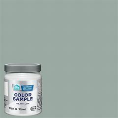
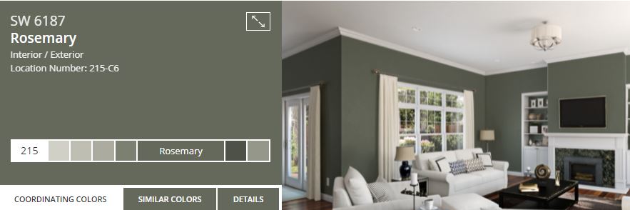
Suppose you lived in a planned community and your neighbor has the same model home as you do. You visit her home and you fall in love with her choice of wall color. You want it in your home. So you buy the same exact paint and after the cost of paint and a painter, why don’t you love it as much as you thought you would? The reason is lighting. Every single home gets different natural light and this plays a huge part in how paint looks on a wall. Besides natural light let’s look at light bulbs. There are soft white, warm white, bright white, daylight and more. All of them affect color to some degree. Then you need to look at where the lighting is coming from. Is it overhead or lamp light? My advice is to always get sample paint and buy foam boards from the dollar store. Paint as many as you can and hang them in various places in the room you are looking to paint. Look at them in the morning, the afternoon and in the evening. Examine them when your lights are turned on. Do you still love the color? If you do great! If you don’t, make a note of why. Was it too dark, was the undertone too pink or too blue. These notes will help you in getting to that perfect color for your home…and you’re only out the cost of a sample and some cheap boards!
Steps for success
It’s not as simple as choosing a color from a sample chart…or a paint chip that catches your eye when you’re at the paint department of your favorite store. Let’s take white for instance. There are literally thousands of shades of white…none of them the same both on the charts as well as how they will appear on the walls of your home. You will have to ‘take it to the next step’ as I’ve suggested above. By investing a small amount of time, effort and money, you’ll be on your way to having the perfect color adorn your walls!